|

|
Look and Feel
To help you better understand what to look for when it comes to “look and feel”, I have critiqued some user screens below. These screens were taken from some of the most popular products in the land, and I think that studying these screens will help you become a better evaluator of any accounting software system. ACCPAC Advantage Look & Feel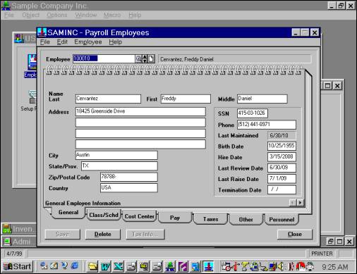 The ACCPAC Advantage Series screen shown above is used to set up employees. Likes: I like the way ACCPAC uses tabs to organize the seven dialog boxes – it creates a very natural look and feel and users don’t feel lost when they navigate from screen to screen. Notice also that ACCPAC has positioned the employee number and name above this tabbed dialog box, making it visible no matter which tab you select. This is very good design. (To learn more about tabbed dialog boxes you might want to read this good article: http://www.iarchitect.com/tabs.htm). Finally, I like how ACCPAC has thrown in the spiral bound notebook look and feel to provide a familiar metaphor that we can all relate to. Dis-Likes: I do not like the fact that screen does not fill the whole page – you can still see the clutter in the background from other applications. In my opinion, it would be cleaner if the screen grew to fill the entire viewable area. To be fair, I know that this is very difficult to achieve since users have so many types of monitors with differing levels of resolution. I also do not like the way the data fields are positioned on the screen – the eye has to dart back and forth to enter or read the data. I prefer titles that line up evenly, fields that line up evenly, and field lengths that are the same. It seems to come across more comfortably. If you study this screen carefully, you will also see that there are no short cut key strokes provided to navigate the tabs. This means you must use a mouse in combination with the keyboard. I prefer those products that allow the user to avoid the mouse completely if they prefer. Once you gain proficiency with a system, the mouse just slows you down. I would also like to see some icons added to make it easier to say, print the employee information with a click of a button, or help you quickly set up a new record. Microsoft Great Plains Look & Feel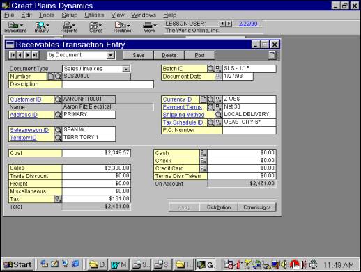 The Great Plains screen shown above is used for entering a receivable transaction. Likes: I like the way Great Plains uses colors – it seems to make it easier to pick out the fields. I like the way that the Great Plains background fills the screen to hide background clutter from other applications. I like the way Great Plains provides hyperlinks in some of its field labels to make it easy to jump around the system – I think this very clever, and very usable. I like the VCR buttons at the top, however they need to add fast forward functionality to these buttons to allow the user to jump, say, 20 records at a time through the database. I like the magnifying glass that allows you to easily drill down into the data – this is very natural and works well. I Like the quick button in the upper right hand corner that makes it easier to enter your next transaction. Dis-Likes: Great Plains does not use tabbed dialog boxes very well. For example, at the bottom of the screen you will see two buttons for distribution and commission. Selecting these buttons will cause additional screens to pop up, which eventually clutter and confuse. I prefer tabs. (you can see my point better by looking at the Great Plains inventory set up screen in which there are nine different windows used to set up a single inventory item.) MAS 90 Look & FeelThe MAS 90 screen shown above is used to set up an inventory item. Likes: I like the tabs at the top, the VCR buttons at the bottom left, and the magnifying glass icons that help you drill down into the system. I especially like the fact that you can see the current company code and the current period shown in the bottom right hand corner of the screen – this helps users make sure that are entering data into the correct company and correct period with just a glance. Dis-Likes: This screen is rather busy to me. I think that the programmers would have been better off by creating a couple more tabs, and then organizing the data fields a little better. For example, the nine buttons in the top right hand corner could have been lined up in a single column, or better yet, in an embedded tabbed dialog box on a separate tab. The white data field boxes could be positioned a little better so that their left edges lined up to a gridline. Navision Look & Feel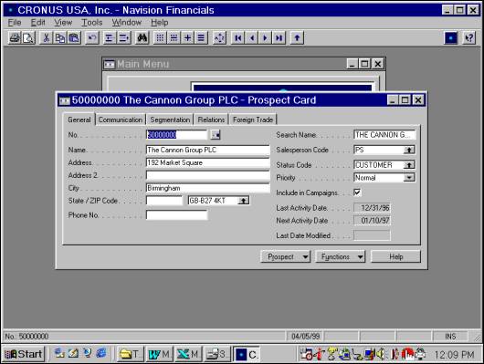 The Navision screen above is taken from the Contact Management module where prospects are setup and maintained. Likes: I like the Navision tabbed dialog box, the way the titles and data field are lined up, and I especially like allow of the icons at the top of the screen that allow the user to quickly search, drill and manipulate the data. I like the way Navision’s background fills the screen to hide the background clutter from other applications. I also like the fact that the name of the open company appears at the top of the screen, and the current period appears at the bottom. The Prospect and function buttons are pull down menus that work well – providing easy access when needed, but not cluttering the screen with a dozen menu options. Navision’s design is extremely consistent throughout the product. Dis-Likes: I think that the font is a little hard to read because it is too small – perhaps an increase of 1 point would help. However, it may be that the gray background is too dark, and this is why I feel that the titles are a little harder to read compared to other products. I think that Navision could use a little more color – it seems to come across a little dull. Also, I am not sure that the dots connecting the field labels to the data fields are necessary – but this is certainly not a big deal. ConclusionLook and feel is an important consideration. In general, you are
looking for screens that appear to be well-organized, easy to read, and easy to understand. There should be numerous buttons
at your disposal to help you quickly drill, filter, and print the data. I hope these ideas help when you evaluate your next
accounting system. Good luck.
- END -
Look and Feel
|